
Exploring New Components in Material 3 for Compose


In this post, I will explore new components in Material 3 for Compose in this blog. Many new components are added to M3 for Compose. You'll gain a bird’s eye view of what Material 3 is and what the default settings are that come with the new Android Studio, Compose projects, and the two new components — Bottom Sheets and DatePickers.
What is Material 3?
Material 3 is the latest version of Google’s open-source design system. You can design and build beautiful, usable products with Material 3.
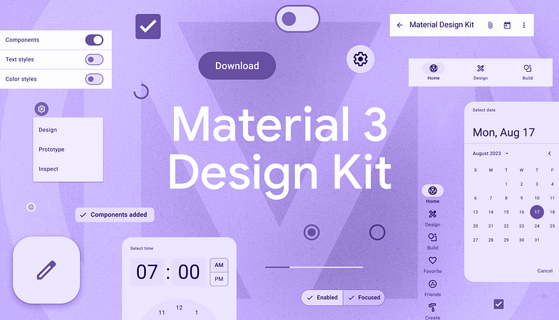
Image Credit: Material 3 Design Kit
Material 3, based on the Material You design, is the recommended design system for creating UIs in phones, tablets, and foldables.
Material 3 for Compose
As of October 2023, Material 3 for Compose is stable and ready to be used in production. Using this library, you can start building beautiful UIs in Jetpack Compose that can be used in building beautiful android apps and Kotlin Multiplatform Apps!
Material 3 has updated design theming, dynamic colors, renewed UI components, improved typography, and more accessibility features.
Theming in Material 3 Compose
Material 3 (M3) enables customization of colors, shapes, and typography.
M3 comes as the default design system in new Android Studio projects. These projects are, by default, equipped with the M3 theming support. The themes and color schemes are a great way to start with Material 3 in your new projects.
Here, you can find the default code snippet provided with the new Android Studio projects above. First, you can use this theme directly and gradually add new colors, fonts, and sizes to it as and when needed. The default code also comes with a provision to use dynamic color themes. Note that the default code also has light and dark themes in case the target device has SDK version < 31, or if you don’t want to use dynamic colors and go for the traditional light and dark themes of your choice.
Material 3 with New Android Studio Projects
Starting with Android Studio Flamingo Canary 6, new Android Projects come with default Material 3 settings for all templates from Empty Activity, and Bottom Navigation View Activity to Navigation Drawer Activity.
So start away with exploring M3 with new projects with Android Studio Famingo Canary 6 and above!
Material 3 Compose 1.1.0 New Components
After the stable release late last year, v1.1.0 for M3 Compose has many stable component releases. Let's take a look at these production-ready components.
Bottom Sheets
We have been using bottom sheets for a long time, and it is exciting to see this component stabilize. Bottom sheets can be used in various cases, such as showing users options, providing full-screen details for a product item, showing share options, showing filters, etc.
There are two types of Bottom Sheets: Standard and Modal
Let's discuss each in-depth and look at how to implement them in Compose.
Standard Bottom Sheets
Standard Bottom Sheets can be extended to the top of the screen to be shown over the existing UI with a drag handle to drag the sheet up and down. These mostly show a details screen for a list item, detailed filter options, etc.
These types of bottom sheets can be used using a BottomSheetScaffold.
Here, BottomSheetScaffold defines the fullscreen bottomsheet and takes parameters like scaffoldState, sheetPeekHeight, topBar, sheetDragHandle, sheetContent, content, etc. Each of these parameters helps shape the bottomsheet UI.
- scaffoldState — is used to hold the state of the bottom sheet. In the example above, we have initialized this state with the initial SheetState to skip the partially expanded state and to skip the hidden state with skipPartiallyExpanded and skipHiddenState, which, when set to false, helps us collapse the bottom sheet entirely.
- sheetPeekHeight — as the same suggests, sets the peek height for the bottom sheet when collapsed/expanded partially.
- topBar — used to set the top app bar for the screen.
- sheetContent — defines the contents of the bottom sheet,
- sheetDragHandle — is an optional field that can be used to show, hide, or customize the bottom sheet handle to expand and collapse the sheet.
- content — defines the composable that makes up the screen UI on top of which the bottom sheet shows and hides.
Modal Bottom Sheets
Modal Bottom Sheets behave like a dialog, shown on top of the existing UI while dimming the underlying UI. These are mostly used to show finite list of options to users, show a few details, advanced share options, quicl filter options, etc. Modal sheets can be used as standalone composables just like any other composables.
Here, ModalBottomSheet is a standalone component and can be shown or hidden with just a boolean MutableState. It takes parameters like sheetState, scrimColor, content, dragHandle, containerColor, contentColor, onDismissRequest, etc.
- sheetState — used the SheetState parameter, which helps to customize the sheet state.
- scrimColor — used to set the background color, to color the content of the screen behind the modal bottom sheet. Typical it is a dim black color.
- content — is again the content of the modal bottom sheet
- onDismissRequest —executes when the user clicks outside of the bottom sheet. This function is executed when the modal bottom sheet is dismissed.
- sheetDragHandle — the drag handle on top of modal bottom sheets can be customized like the standard bottom sheets.
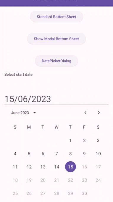
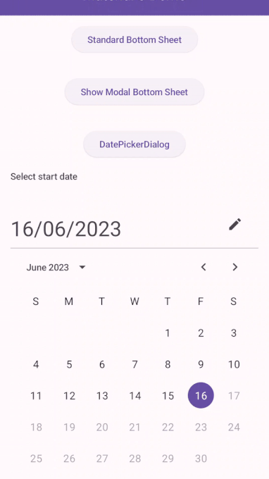
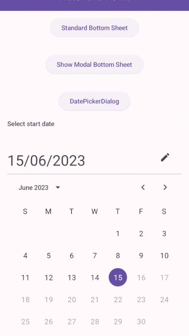
DatePickers
DatePickers are brand-new selection components in M3.
DatePicker
DatePicker allows users to select date from a calendar like UI and also gives the users to input date from a TextField.

DatePicker takes in parameters like state, title, headline, colors, dateFormatter, etc.
- state — rememberDatePickerState state of the datepicker which is used to initialize the datepicker’s default selected date, initial display mode (calendar UI to select date or input field to enter date).
- title — title displayed on top of the date picker. Takes in any composable like Text or a variant of DatePickerDefaults.DatePickerTitle.
- headline — The headline which displays the selected date on top of the datepicker. Takes in any composable or a variant of DatePickerDefaults.DatePickerHeadline.
- colors — colors can be used to customize the datepicker with your app’s colors.
For Material 3 v1.1.0, the colors for DatePicker are not producing any changes. Issuetracker for the same can be found here.
- dateFormatter — The DatePickerFormatter for the date picker dates.
- showModeToggle — indicates whether the input mode can be changed by the user or not
SelectableDates (v1.2.0-alpha02) — we can restrict date selections by setting the selectableDates parameter of the DatePickerState.
It can be set like that found here. The color disables and restricts users to select future dates.
DatePickerDialog
It is similar to the DatePicker but shows the picker in a dialog. In most of the real-life scenarios, DatePickerDialog is often more usable, accessible, and wiser-to-show option.
DatePickerDialog comes with the following parameters:
- onDismissRequest — called when the dialog is dismissed by the user by pressing outside the dialog.
- confirmButton — button ideally used to confirm date selection.
- dismissButton — button ideally used to cancel date selection.
- properties — used to set DialogProperties like the booleans dismissOnBackPress and dismissOnClickOutside.
Other parameters like colors, shape, tonal elevation, etc., help customize the DatePickerDialog.
GitHub repo for the above components can be found here: